
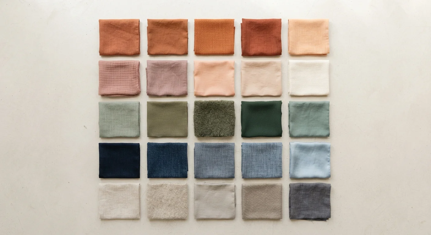
Why Color Is a Style Superpower
Before you think about silhouettes, fabrics, or accessories, color is doing most of the visual heavy lifting in any outfit. It's the first thing the eye registers — before fit, before texture, before price tag. When your color choices are working together, an outfit can look expensive, polished, and intentional even if it came entirely from a thrift store.
Color shapes perception in tangible ways: warm hues tend to feel energetic and approachable; cool tones can read as calm or authoritative. Earthy, muted palettes feel grounded and sophisticated; bright, saturated colors signal confidence and playfulness. None of these are better or worse — they're just different tools, and knowing your toolkit changes how effectively you can use it.
For a broader foundation in building your overall look, this complete personal style framework covers every dimension from clothing and color to accessories and context.
90 sec
Time before color shapes first impressions
Research in environmental psychology suggests that color accounts for a significant portion of initial judgments made within the first 90 seconds of an interaction, according to studies reviewed in the journal Management Decision.
62–90%
Share of snap judgments attributed to color alone
Studies on consumer and interpersonal perception consistently find that color accounts for the majority of first-impression assessments, underscoring its outsized role in how appearance is read.
Starting With Undertone: Warm, Cool, or Neutral
The single most useful piece of color knowledge is understanding your skin's undertone — the subtle hue beneath your surface complexion that stays constant regardless of tanning or fading. Undertone falls into three broad families: warm (golden, peachy, yellow-based), cool (pink, red, or bluish-based), and neutral (a blend of both).
Why does this matter? Colors have undertones too. A forest green leans warm-earthy; a teal-blue-green leans cool. When your skin's undertone and your clothing's undertone are in harmony, you tend to look brighter and more vibrant. When they clash, skin can appear sallow, washed out, or ruddy.
A simple home test: drape a warm-toned fabric (mustard yellow, burnt orange) and a cool-toned fabric (lavender, icy blue) near your face in natural light, with no makeup if possible. Notice which one makes your complexion look alive and which one seems to drain it. That observation is your starting point.
Try the Fabric Drape Test at Home
Gather a few scarves, t-shirts, or even paper in warm and cool shades. Hold each close to your face in front of a mirror in natural daylight — no artificial bulbs, which skew color perception. The hue that makes your eyes pop and skin look even is pointing you toward your undertone family. It takes five minutes and costs nothing.
Building Your Personal Palette
Once you have a sense of your undertone, building a palette is a creative, iterative process. Think in three layers:
- Neutrals (2–3 shades): These are your foundation — colors that pair with nearly everything. Warm-toned people often gravitate toward camel, cream, and warm brown. Cool-toned people typically feel great in navy, soft white, and charcoal.
- Mid-tones (2–3 shades): Colors that bridge your neutrals and brights — muted greens, dusty roses, slate blues. These add depth without overwhelming.
- Accent colors (2–3 shades): Your personality colors. They make outfits memorable and reflect your energy. Even one accent worn consistently starts to become part of your signature.
If you're just starting to define your look, this beginner's guide to finding your aesthetic gives you a solid foundation before going deeper into palette work.
Putting Palette Into Practice
A palette is only useful if it actually shows up in your wardrobe. The good news: you don't need a complete closet overhaul. Start by identifying which pieces you already own that fall within your palette — chances are, those are the items you reach for most. Then, as older pieces wear out, replace them with options in your palette rather than impulse colors.
Color placement is another tool worth understanding. If you love a color that doesn't quite harmonize with your complexion, wear it below the waist or as an accessory. Reserve your most flattering shades for areas near your face, where the contrast effect is strongest.
For more on building coherence without starting from scratch, this guide on developing a signature look offers practical next steps. And if you want to go deeper on how colors actually work together in outfits, color coordination without a fashion degree is a great companion read.