
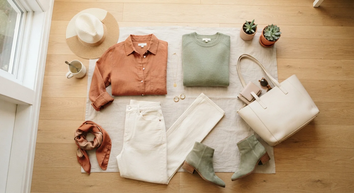
Why Color Coordination Feels Hard (And Why It Isn't)
Standing in front of your closet wondering if that burgundy top actually goes with those olive pants? You're not alone — and the good news is that the discomfort is almost entirely a confidence gap, not a talent gap. Color coordination isn't an instinct you're born with; it's a set of learnable principles that stylists use every day.
Most people were never taught these principles explicitly. Fashion media tends to show finished looks without explaining the reasoning behind them, which makes it seem like good taste is mysterious or exclusive. It isn't. Once you understand a few basic relationships between colors, getting dressed starts to feel less like guesswork and more like a simple decision tree.
For a broader framework on how color fits into your overall personal style, this complete personal style guide is a great companion read.
Hue
The pure color itself — red, blue, green — before any lightening, darkening, or muting is applied.
Saturation
How vivid or intense a color appears. A highly saturated color looks bold and bright; a low-saturation color looks muted or dusty.
Complementary colors
Colors that sit directly opposite each other on the color wheel, such as blue and orange. They create strong visual contrast when paired.
Analogous colors
Colors that sit adjacent to each other on the color wheel, like green, teal, and blue. They tend to feel naturally harmonious together.
Undertone
The subtle warm (yellow, peachy) or cool (pink, blue) quality beneath a color's surface that affects how it looks against your skin.
Monochromatic
An outfit built from a single color family using different shades, tints, and textures for variety.
The Color Wheel, Simplified
The color wheel is the foundational tool designers, painters, and stylists all reference — and you don't need an art degree to use it. At its core, the wheel organizes colors by their relationships to one another.
- Primary colors (red, blue, yellow) are the building blocks.
- Secondary colors (orange, green, violet) are created by mixing two primaries.
- Tertiary colors (like red-orange or blue-green) sit between them.
Two equally important concepts are hue (the pure color itself), saturation (how vivid or muted it is), and value (how light or dark). Two colors can share the same hue but look very different depending on saturation and value — think sky blue versus navy. Coordinating these qualities is often what separates a polished outfit from one that feels off.
To understand how palette shapes your overall look, this deeper dive into color confidence explores tone identification in detail.
Three Reliable Formulas Anyone Can Use
You don't need to memorize the entire color wheel. These three formulas handle the vast majority of everyday outfit decisions:
- Monochromatic: Stick to one color family and vary the shades. Navy top, medium-blue jeans, and pale blue sneakers create a cohesive, intentional look with minimal effort.
- Analogous: Choose colors that sit next to each other on the wheel — like green, teal, and blue. These combinations feel harmonious because the colors share undertones.
- Complementary: Pair colors directly opposite on the wheel, such as orange and blue, or purple and yellow. Complementary pairings have natural contrast and visual energy — use the bolder color sparingly as an accent if you want a subtler effect.
Use Your Phone as a Quick Reference
Not sure if two pieces work together? Hold them up side by side and photograph them in natural light. The camera often reveals clashes or harmonies your eye misses in the moment. Some people keep a running photo album of combinations that work well for fast decision-making on busy mornings.
When mixing patterns, color coordination becomes even more important — the rules of pattern mixing explain how to keep clashing prints from overwhelming an outfit.
Working With Neutrals as Your Foundation
Neutrals — white, black, gray, beige, camel, navy, and cream — are the workhorses of a coordinated wardrobe. They pair with virtually everything, which makes them ideal anchor pieces around which you can layer color strategically.
The key insight: neutrals don't just match colors, they buffer them. If you're unsure whether two colors work together, adding a neutral between them (a white shirt under a printed jacket, for example) almost always resolves the tension.
It's worth noting that neutrals have undertones too. Warm neutrals like camel and cream pair naturally with other warm tones (olive, rust, gold), while cool neutrals like true white and heather gray complement cool tones (lavender, cobalt, blush). Mixing warm and cool neutrals can sometimes look muddy rather than intentional.
Curious whether a mostly neutral wardrobe is right for you? That article weighs the real trade-offs honestly.
Common Mistakes and Easy Fixes
Even experienced dressers run into these pitfalls — knowing them means you can sidestep them quickly:
Don't Trust Store Lighting
Fluorescent and yellow-tinted store lighting can dramatically distort how colors look together. Whenever possible, step outside or toward a window before committing to a combination. This is especially important with neutrals, where subtle undertone mismatches are hardest to detect indoors.
- Matching too precisely: Wearing the exact same shade of red in your top, bag, and shoes can look costume-like. Vary the shade or tone slightly for a more sophisticated result.
- Ignoring saturation: A bright, saturated yellow and a muted dusty rose occupy very different energy levels. Combining colors with wildly different saturations can feel unbalanced — lean toward similar saturation levels when in doubt.
- Forgetting that prints count: A floral shirt already contains multiple colors. Pull one of those existing colors out for your bottoms or accessories rather than adding a new unrelated color.
- Overlooking skin tone undertones: Colors reflect against your skin and hair. Experimenting in natural light — not harsh store lighting — gives a more accurate read of what works for you personally.
Confident color choices are a cornerstone of dressing with intention, a practice that makes every outfit feel purposeful rather than thrown together.