
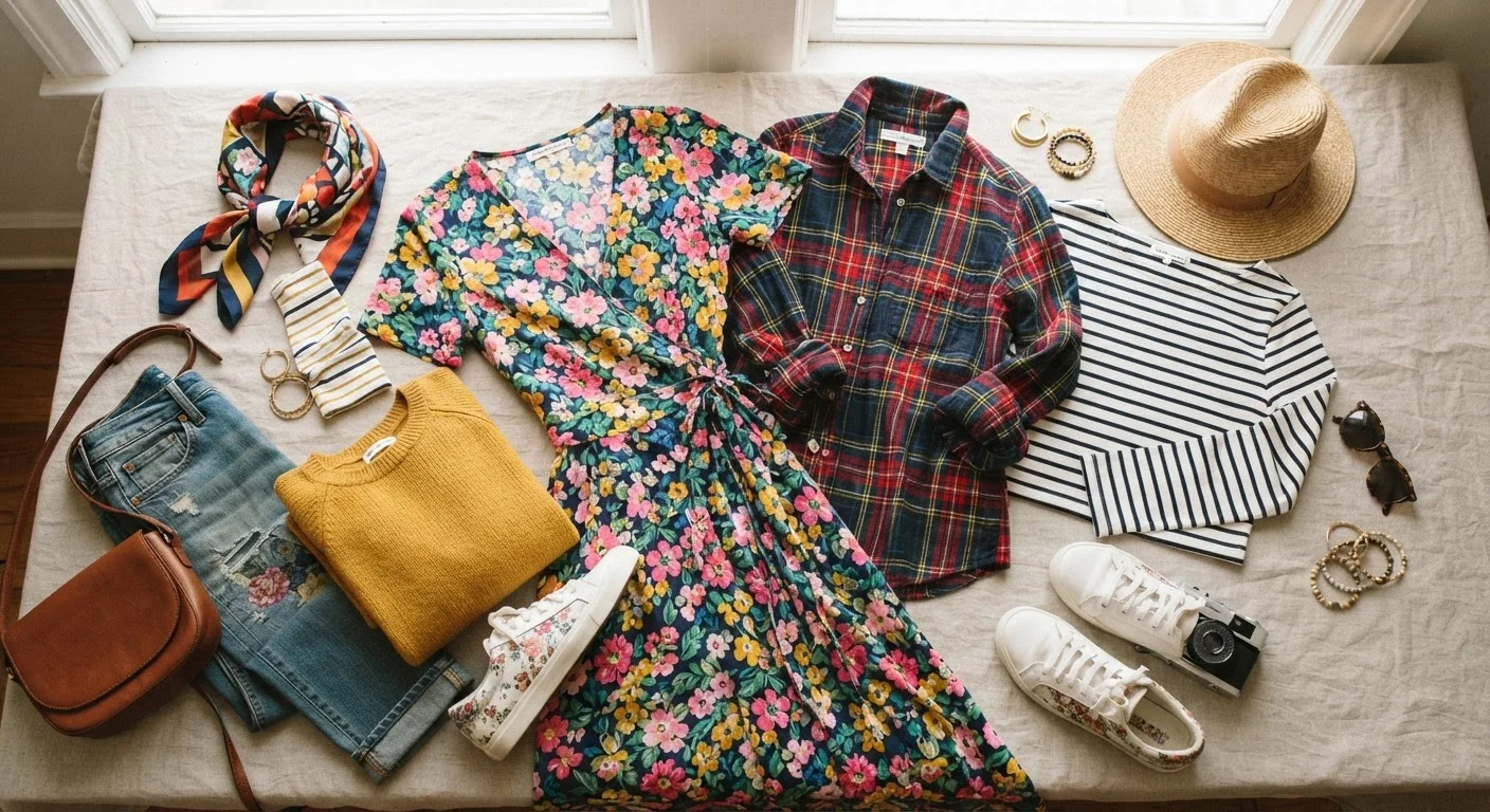
Why Pattern Mixing Feels Risky (But Isn't)
Most of us were quietly taught that mixing prints is a mistake reserved for bold eccentrics — or people who simply don't know better. That messaging stuck. Walk into most American closets and you'll find a careful habit of separating patterns: stripes with solids, florals saved for standalone statements.
The reality is that pattern mixing has genuine logic to it. It's not arbitrary rule-breaking or pure instinct. Once you understand what's actually happening visually when two prints live together, the whole process stops feeling like a gamble. As our guide on why outfits feel off even when each piece is nice explains, most style friction comes from a few fixable principles — and pattern mixing is no different.
Vary the scale between any two patterns you're combining.
When two patterns are the same size, they compete for attention at the same visual frequency, which reads as noise rather than intention. Pairing a large pattern with a smaller one creates hierarchy — the eye knows where to land first and where to move next.
Pull at least one color that appears in both patterns.
Shared color is the connective tissue of a mixed-print outfit. Without it, patterns feel like they belong to different outfits that accidentally ended up on the same person. Even a single repeating hue — a warm tan, a dusty blue — creates the sense that the look was composed rather than thrown together.
Use a solid piece to anchor the combination.
Two competing patterns can overwhelm a look quickly. A solid — whether it's trousers, a belt, shoes, or an outer layer — gives the eye a moment to rest and keeps the patterns from fighting each other. The solid doesn't neutralize the look; it frames it.
Consider pattern category when mixing — not just visual weight.
Geometric patterns (stripes, plaid, checks) and organic patterns (florals, paisleys, abstract) tend to mix more easily than two geometrics or two organics at similar scales. This is because they come from different visual vocabularies, so they don't directly compete in structure.
Keep the rest of the outfit quiet when mixing bold patterns.
Accessories, shoes, and bags have visual weight too. When patterns are already doing a lot of work, stacking jewelry, colorful shoes, and a printed bag on top tips the balance into chaos. Simplified accessories let the pattern mix breathe and be the focal point.
The Principles That Actually Matter
Pattern mixing isn't about courage — it's about contrast and connection. The practices below are the actual mechanics behind every mixed-print look that works. Think of them as guardrails, not rules carved in stone.
For a broader foundation on how color interacts with pattern choices, color coordination without a fashion degree is a useful companion read.
When to Break These Guidelines
Here's the honest part: all of the above can be deliberately broken, and sometimes that's the point. Maximalist dressing — intentional high-contrast, high-volume pattern clashing — is a valid aesthetic choice. The difference between a maximalist look and a chaotic one is almost always deliberate selection and some element of cohesion, even if it's subtle.
Intentional Clashing Is Its Own Skill
Deliberately breaking scale and color rules — pairing two large-scale, wildly different prints with no shared color — is a recognized stylistic technique, not just a mistake that got away with itself. The key is that it reads as a choice: confidence in posture and fit, a restrained accessory choice, or a single tonal anchor somewhere in the outfit signals intention. If you want to explore this territory, start small — try it at home before committing to a public outing, and pay attention to how the look feels rather than how daring it seems.
If you want to explore how these ideas fit into a broader approach to getting dressed, dressing with intention covers principles that hold across every style, minimalist or maximalist. And if you're curious about when consistency in your wardrobe serves you better than variety, the case for dressing consistently lays it out clearly.
“Fashion is about dressing according to what's fashionable. Style is more about being yourself.”
— Oscar de la Renta, Fashion designer